You know when you visit a blog where the colors are more than a garnish, like they are within the page content. Choose the "palette" of correct color it may be harder than you think. Just choose not only beautiful or bright colors, one must also take into account other important factors such as:
- The colors have to represent your brand
- They need to be appropriate to your audience
- Finally, it is necessary that they are in harmony with each other

In any case, whatever your product/service, avoid sharp contrasts is always a good idea. Nor should avoid using a large number of colors different as this may distract the visitor. Choose a simple color scheme and use it without worry.
Need help choosing a color scheme for your site? An interesting tool is the Cymbolism, trying to associate the colors with the right words order to evoke a certain feeling. For example, most people associate gray with words like "winter", "loneliness" or "sadness". Something to be taken into account when developing a website or even a blog.
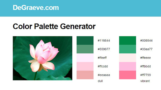
Another interesting tool is the Degraeve - Color Palette Generator, a very interesting tool that extracts the colors of the photos you choose, displaying directly the color palette so that you can better visualize the result.
And you know another interesting tool? Leave a comment below, I'm always looking for new features!
Photos credit: Pixabay
Source: Wix


